- Introduction
- Importance of Color in Design
- Overview of Color Theory
- Understanding Color Theory
- Definition of Color Theory
- Historical Background
- Basic Components: Primary, Secondary, and Tertiary Colors
- Color Wheel Fundamentals
- Explanation of the Color Wheel
- Relationships Between Colors (Complementary, Analogous, Triadic)
- Color Harmony
- Definition and Importance
- Types of Color Harmonies
- Monochromatic
- Complementary
- Analogous
- Triadic
- Tetradic
- Psychological Impact of Colors
- Emotional Responses to Colors
- Cultural Differences in Color Perception
- Case Studies on Color Psychology in Design
- Using Color to Create Mood and Atmosphere
- Warm vs. Cool Colors
- Neutral Colors and Their Uses
- Examples in Interior Design
- Color Contrast and Readability
- Importance of Contrast in Design
- Techniques for Achieving Optimal Readability
- Examples in Web Design
- Color in Branding and Marketing
- Role of Color in Brand Identity
- How Big Brands Use Color
- Tips for Choosing Brand Colors
- Color Trends in Modern Design
- Current Color Trends
- Influence of Technology on Color Trends
- Predictions for Future Color Trends
- Tools and Resources for Choosing Colors
- Online Tools (Color Pickers, Palettes)
- Software Solutions (Adobe Color, Canva)
- Physical Resources (Pantone Color Guides)
- Implementing Color Theory in Various Design Fields
- Graphic Design
- Web Design
- Interior Design
- Fashion Design
- Case Studies
- Successful Use of Color Theory in Famous Designs
- Analysis of Popular Websites and Their Color Schemes
- Common Mistakes in Using Color
- Overuse of Vibrant Colors
- Ignoring Cultural Significance
- Poor Contrast and Readability
- Tips for Beginners
- Starting with Basic Palettes
- Experimenting with Different Color Schemes
- Learning from Existing Designs
- Conclusion
- Recap of the Importance of Color Theory
- Final Thoughts on Implementing Color in Design
- FAQs
- How Does Color Theory Affect User Experience?
- What Are the Best Practices for Choosing Colors in Web Design?
- How Can I Learn More About Color Theory?
- What Are the Most Commonly Misunderstood Aspects of Color Theory?
- How Do Cultural Differences Impact Color Choices in Design?
The Role of Color Theory in Effective Design
Introduction
Color is more than just a visual element; it’s a powerful communication tool in design. It can evoke emotions, create a mood, and even influence decisions. Understanding the role of color theory in effective design is crucial for any designer aiming to create visually appealing and meaningful work. In this article, we will delve into the principles of color theory, its psychological impact, and how to apply it across various design fields.
Understanding Color Theory
Definition of Color Theory
Color theory is a framework that designers use to understand how colors interact and the effects they produce. It encompasses the science and art of using color, drawing from both historical perspectives and contemporary applications.
Historical Background
The foundations of color theory date back to Sir Isaac Newton’s color wheel, created in the 17th century. Newton’s work laid the groundwork for the systematic study of color relationships.
Basic Components: Primary, Secondary, and Tertiary Colors
At the core of color theory are primary colors (red, blue, yellow), which cannot be created by mixing other colors. Secondary colors (green, orange, purple) are formed by mixing primary colors, while tertiary colors are combinations of primary and secondary colors.
Color Wheel Fundamentals
Explanation of the Color Wheel
The color wheel is a circular diagram that illustrates the relationships between colors. It is an essential tool for designers to visualize how colors interact.
Relationships Between Colors
Understanding color relationships is vital for creating harmonious designs:
- Complementary Colors: Opposite each other on the color wheel, they create high contrast and vibrant looks.
- Analogous Colors: Next to each other on the wheel, they produce serene and comfortable designs.
- Triadic Colors: Evenly spaced around the wheel, they offer a balanced and dynamic color scheme.
Color Harmony
Definition and Importance
Color harmony refers to the aesthetically pleasing arrangement of colors. It’s crucial for creating visually appealing and balanced designs.
Types of Color Harmonies
- Monochromatic: Variations of a single color.
- Complementary: Two colors opposite each other.
- Analogous: Three colors side by side.
- Triadic: Three colors evenly spaced.
- Tetradic: Four colors forming a rectangle.
Psychological Impact of Colors
Emotional Responses to Colors
Colors can evoke specific emotional responses. For instance, red often signifies passion or urgency, while blue is calming and trustworthy.
Cultural Differences in Color Perception
Cultural backgrounds can influence how colors are perceived. For example, white symbolizes purity in Western cultures but can represent mourning in some Eastern cultures.
Case Studies on Color Psychology in Design
Analyzing successful designs reveals how color psychology is applied. For example, fast-food restaurants often use red and yellow to stimulate appetite and excitement.
Using Color to Create Mood and Atmosphere
Warm vs. Cool Colors
Warm colors (reds, oranges, yellows) create an energetic and inviting atmosphere, while cool colors (blues, greens, purples) evoke calmness and serenity.
Neutral Colors and Their Uses
Neutral colors (black, white, gray, brown) are versatile and can balance or highlight other colors in a design.
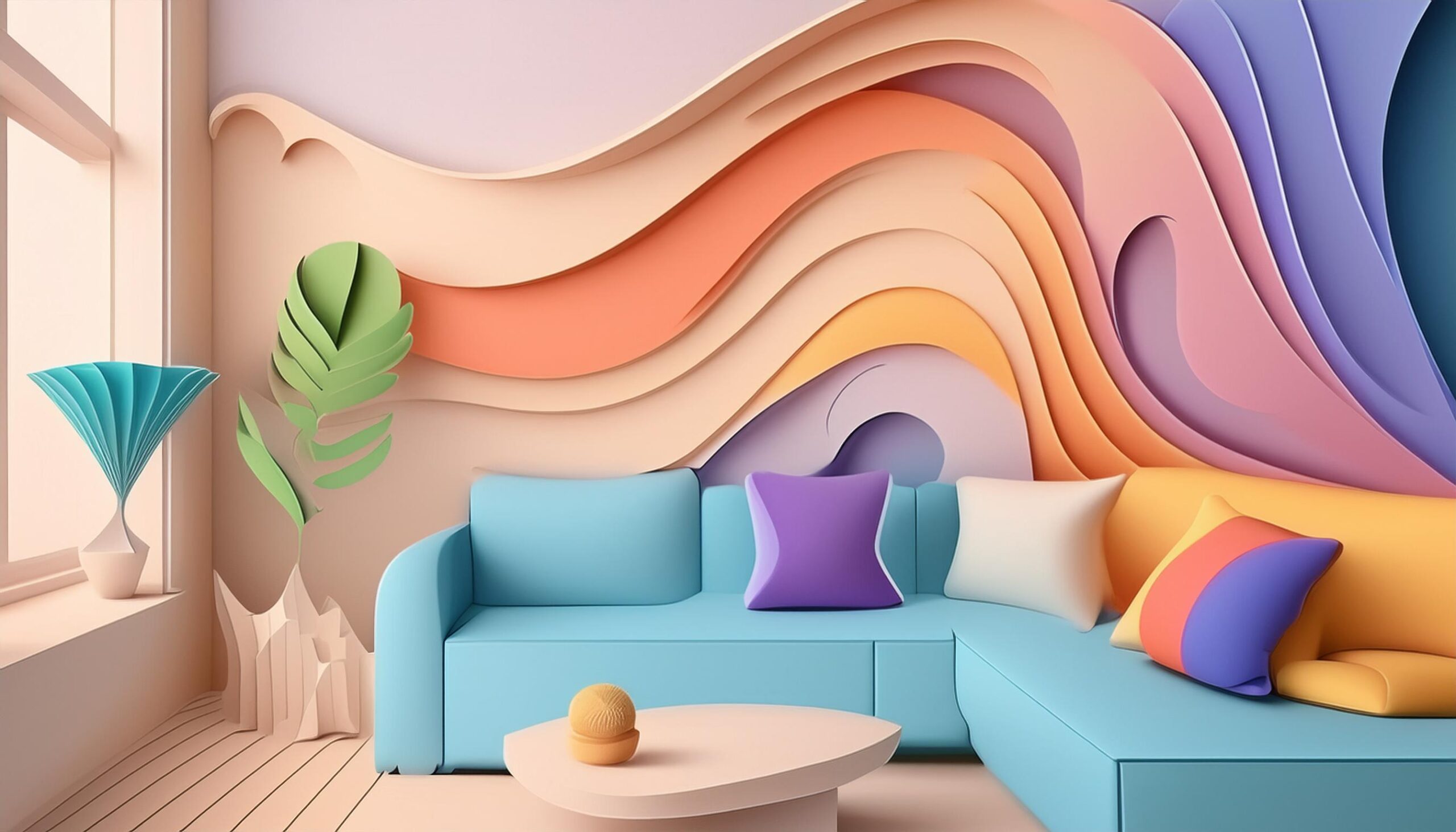
Examples in Interior Design
A living room with warm hues can feel cozy and inviting, while a bedroom with cool tones can promote relaxation.
Color Contrast and Readability
Importance of Contrast in Design
Contrast ensures that text and elements stand out against backgrounds, crucial for readability and accessibility.
Techniques for Achieving Optimal Readability
Using high contrast between text and background, and considering color blindness-friendly palettes, enhances readability.
Examples in Web Design
Websites often use dark text on a light background or vice versa to ensure content is easy to read.
Color in Branding and Marketing
Role of Color in Brand Identity
Colors are integral to brand identity. They convey the brand’s personality and values.
How Big Brands Use Color
Brands like Coca-Cola (red) and Facebook (blue) use consistent color schemes to reinforce their identity and evoke specific emotions.
Tips for Choosing Brand Colors
Consider the brand’s message, target audience, and competitors when selecting colors. Use colors that differentiate and resonate with the audience.
Color Trends in Modern Design
Trends evolve, influenced by cultural shifts, technology, and fashion. Currently, muted colors and pastel palettes are popular.
Influence of Technology on Color Trends
Advancements in display technology and digital media have expanded the possibilities for using vibrant and dynamic colors.
Predictions for Future Color Trends
Expect a rise in biophilic design colors, inspired by nature, and a continued emphasis on sustainability.
Tools and Resources for Choosing Colors
Online Tools
Web-based tools like Adobe Color and Coolors help designers experiment with and create palettes.
Software Solutions
Programs like Adobe Photoshop and Canva offer robust color selection and manipulation tools.
Physical Resources
Pantone color guides provide standardized color references, ensuring consistency across various media.
Implementing Color Theory in Various Design Fields
Graphic Design
Effective use of color enhances visual communication and brand messaging.
Web Design
Color impacts user experience, navigation, and conversion rates.
Interior Design
Colors influence the feel and functionality of spaces.
Fashion Design
Color trends and combinations drive fashion innovation and consumer appeal.
Case Studies
Successful Use of Color Theory in Famous Designs
Apple’s use of sleek, minimalistic colors has set a trend in tech design.
Analysis of Popular Websites and Their Color Schemes
Sites like Dropbox use blue to convey trust and dependability, aligning with their brand values.
Common Mistakes in Using Color
Overuse of Vibrant Colors
Too many bright colors can overwhelm and distract.
Ignoring Cultural Significance
Colors can have different meanings across cultures, affecting global appeal.
Poor Contrast and Readability
Lack of contrast can make content difficult to read, affecting user experience.
Tips for Beginners
Starting with Basic Palettes
Begin with simple, proven palettes and expand gradually.
Experimenting with Different Color Schemes
Don’t be afraid to try new combinations to find what works best.
Learning from Existing Designs
Analyze successful designs to understand effective color use.
Conclusion
Color theory is a fundamental aspect of effective design, influencing everything from mood and readability to brand identity and marketing success. By understanding and applying color theory principles, designers can create compelling and meaningful work that resonates with their audience.
FAQs
How Does Color Theory Affect User Experience?
Color theory enhances user experience by improving readability, guiding navigation, and evoking emotions.
What Are the Best Practices for Choosing Colors in Web Design?
Use high contrast for readability, consider color blindness, and align colors with brand identity.
How Can I Learn More About Color Theory?
Books, online courses, and practical experimentation are great ways to deepen your understanding.
What Are the Most Commonly Misunderstood Aspects of Color Theory?
Misunderstandings often involve the emotional impact of colors and cultural differences in color perception.
How Do Cultural Differences Impact Color Choices in Design?
Cultural variations can lead to different interpretations of colors, influencing design appeal and effectiveness globally.